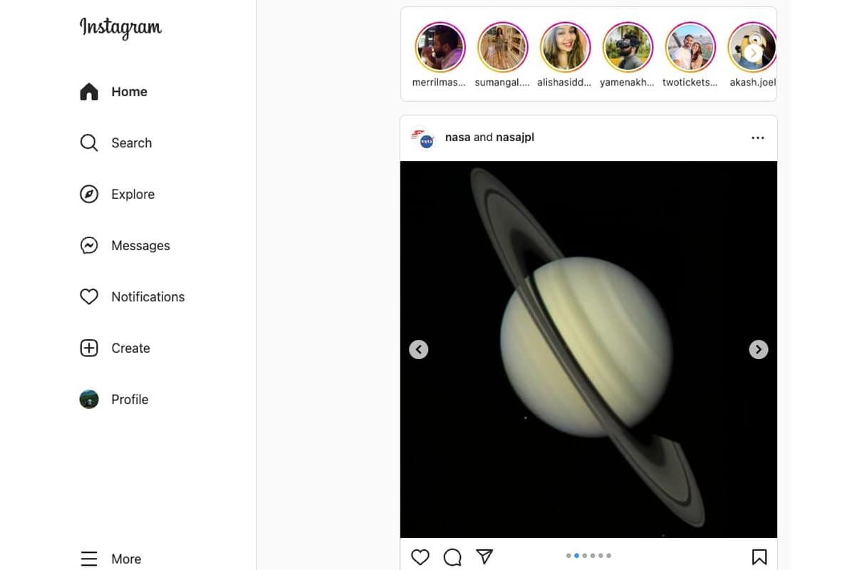
Instagram is rolling out a redesigned version of Instagram for Web. The new features include a navigation sidebar that will come with links to pages including explore, search, messages among others. Earlier, these tabs used to feature as unlabeled buttons at the top. This redesign comes along as Instagram’s CEO, Adam Mosseri, confirms that there will not be a dedicated iPad app for the social media platform. The new UI seems to be rolling out in a phased manner, as the redesign is not available for everyone at the moment.
The new redesign, first noticed by The Verge, seems to be rolling out in a phased manner. There hasn’t been any official announcement regarding the redesign. The redesign comes with links to the tabs on the social media platform including explore, search, message among others.
The Instagram for Web redesign offers more information on the buttons and offers easy access to Settings and saved posts. We at Gadgets360 were also able to notice the new design. Switching between accounts is easier now, and the whole interface is generally faster. Watching videos and navigation is also better, with DMs becoming more immersive.
Commenting on the redesign, Meta spokesperson Christine Pai said the following to The Verge, “we are always working on ways to improve the Instagram.com web experience for people. We recently made updates to modernise Instagram.com, including improving the navigation, optimizing the video experience, and introducing a more immersive way to DM.”
A report last month had revealed that Meta’s Instagram now has 2 billion monthly active users worldwide, closing in on the 2.96 billion who use Facebook, in a sign of the social media giant’s shifting makeup. The company disclosed the number during an otherwise-gloomy earnings report in October, when a shaky ad market clouded Meta’s forecast and sent its shares tumbling. It also said that more than 2 billion people now use its messaging app, WhatsApp, every day. Meta’s total monthly users for its family of apps number 3.71 billion worldwide.

